
What is a tick chart?
A tick chart builds each new bar after a set number of transactions occur, say every 1,000, 2,000, or 3,000 trades, rather than after a set amount of time passes. A 1-minute chart doesn't care how many trades happened in that minute, it draws a bar regardless. A tick chart works the opposite way, it doesn't care how long something takes, it only cares how many trades have printed.
This single difference changes almost everything about how the chart behaves during different market conditions, covered next.
How is market activity represented on a tick-based chart?
Through speed, not price alone. When a lot of trading is happening, news breaking, heavy volume, a burst of activity, a tick chart fills its bars fast, since the transaction count hits its threshold quickly. When trading is quiet, thin volume, nobody doing much, the same chart slows way down, taking longer to accumulate enough trades to close out a bar.
That means the chart itself is a rough proxy for participation. Bars stacking up rapidly tells you something's actively happening right now. Bars forming slowly tells you the opposite, without needing to check a separate volume indicator to know it.
Is a tick chart based on time?
No, not directly. Time still passes while a tick chart forms, obviously, but the chart's structure doesn't care how much of it passed. A bar closes purely because it hit its trade count, whether that took four seconds or four minutes depends entirely on what the market was doing at that moment, not on any clock.
This is the core thing that trips people up coming from time-based charts. There's no fixed rhythm here. The chart moves at the market's pace, not the clock's.
What's the difference between tick charts and one-minute charts?
A one-minute chart guarantees you a new bar every sixty seconds, always, even if almost nothing traded during that minute. You'll get a flat, nearly empty bar during dead periods, and a chaotic, information-packed bar during a burst, both squeezed into the same fixed sixty-second box regardless of how much actually happened inside it.
A tick chart adapts instead. During a burst of activity, it produces several bars in the time a 1-minute chart would've drawn just one, giving you more visual granularity exactly when the most is happening. During a quiet stretch, it produces almost nothing, which some traders actually prefer, since it filters out low-information stretches rather than forcing a bar to exist just because a minute went by.
Why do active markets create tick bars faster?
Because the bar's only requirement is hitting a transaction count, and active markets rack up transactions faster. More buyers and sellers trading means more individual trades printing per second, which means a fixed threshold, say 2,000 trades, gets reached sooner.
It's really just a counting mechanism. Nothing fancier than that. Busy market, fast count, quick bars. Quiet market, slow count, sluggish bars.
How do I read a tick chart?
The individual bars themselves read exactly like any other candlestick or OHLC bar, open, high, low, close, same as a time-based chart. What changes is how you interpret the pacing between bars, not the shape of any single one.
Watch how quickly bars are forming as a rough read on current participation, alongside the usual price action you'd already be studying, support, resistance, trend, pattern formations. A sudden acceleration in bar formation, several closing in rapid succession, often lines up with a genuine shift in activity, worth paying attention to alongside whatever the price is actually doing.
What does a 2,000-tick chart mean? What does a 3,000-tick chart mean?
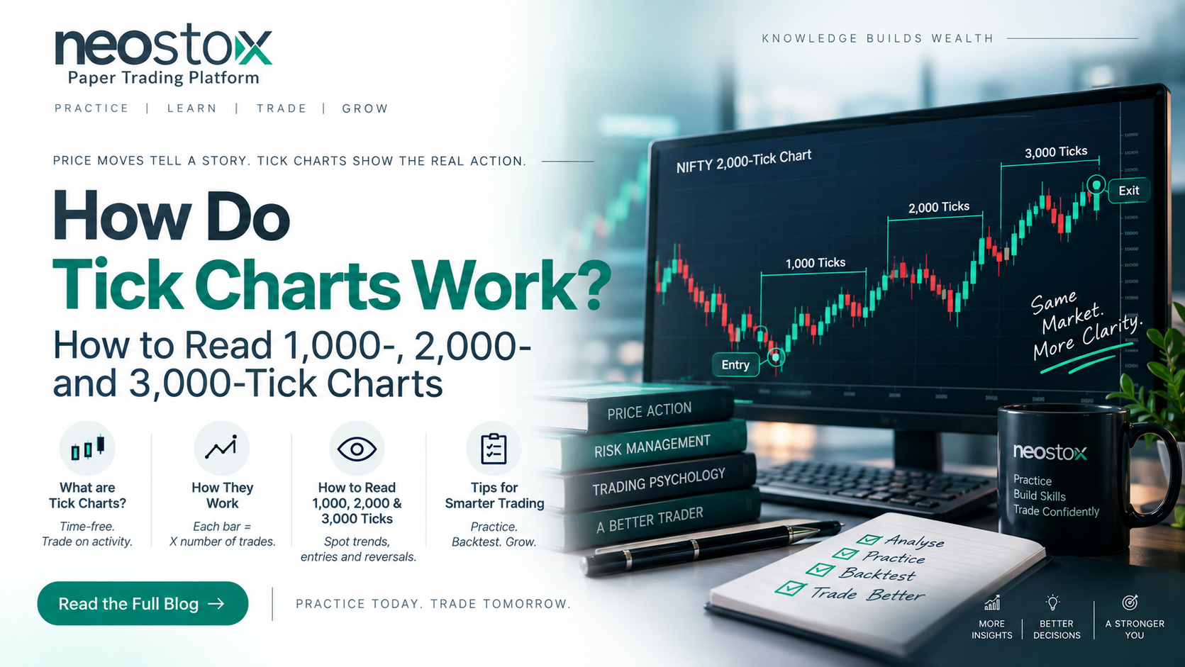
The number is just the trade count each bar waits for before closing. A 2,000-tick chart closes a bar every 2,000 transactions. A 3,000-tick chart waits for 3,000. Higher numbers mean each bar represents more trading activity, producing a smoother, less noisy chart, similar in spirit to stepping up from a 1-minute chart to a 5-minute chart.
Lower tick counts, say 500 or 1,000, produce more bars, more frequently, capturing finer detail at the cost of more noise. Choosing a tick count is a lot like choosing a timeframe, just using transaction count as the clock instead of actual time.
How many minutes is 2,000 ticks? How much time is 2,000 ticks?
There's no fixed answer, and that's genuinely the point of the whole approach, not a gap in this explanation. During a fast, active session, 2,000 trades might print in well under a minute. During a slow, quiet stretch, the exact same 2,000-trade threshold could take considerably longer to fill.
If you need a rough, illustrative sense of it: a highly liquid, actively traded instrument during a busy session might fill a 2,000-tick bar in a minute or two, while a quieter instrument or a dead part of the session could stretch that same bar out well beyond that. Treat any specific number you see quoted online as one moment's snapshot, not a rule the chart follows generally.
What tick-chart setting should a beginner understand?
Start with a higher tick count, something in the 3,000 to 5,000 range is a common, more forgiving starting point, since it produces smoother, less noisy bars while you're still getting used to how the chart behaves differently from a time-based one. Dropping to a lower tick count, more bars, more noise, tends to make more sense once you're already comfortable reading the pacing signal covered above.
There's no universally "correct" setting, it depends on the instrument's typical activity level and your own trading style. Treat your first tick count choice as a starting point to adjust, not a permanent decision.
Watching how activity actually shapes a chart, in real time, sinks in a lot faster through practice than through reading about it. Neostox's charting tools let you study price action on live NSE and BSE market conditions across equities, futures, and options, and paper trading gives you a place to get a feel for how tick-based and time-based charts behave differently, using virtual money while you're still building that instinct.