
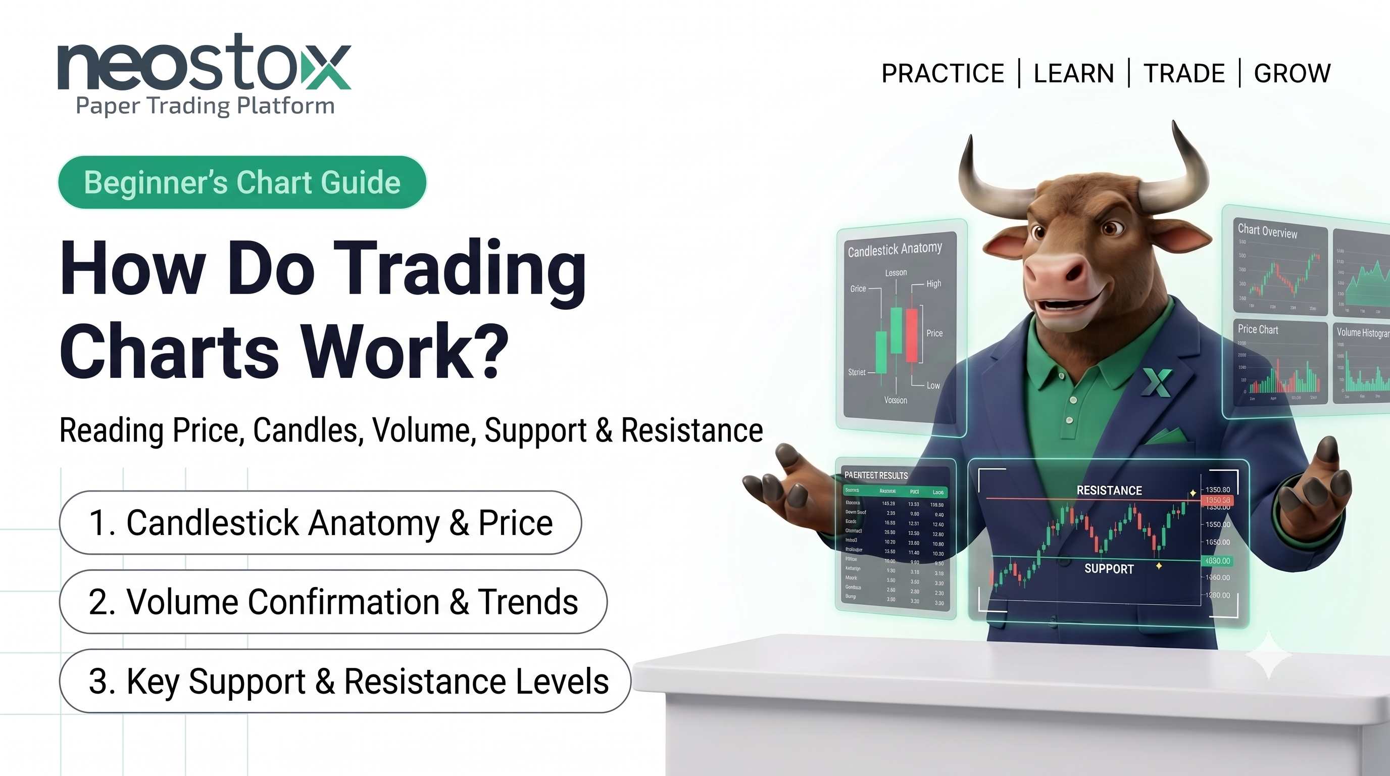
A trading chart plots an instrument's price over time, with time running along the bottom axis and price running up the side. Most traders read it through candlesticks, which show the open, high, low, and close for each time period at a glance, alongside a volume bar underneath showing how much was traded. Support and resistance are simply price levels where the chart shows buying or selling pressure has shown up before. Once you can identify these pieces on sight, you can read any trading chart, regardless of the stock, index, or timeframe in front of you.
What is a trading chart?
A trading chart, also called a trading graph or price chart, is a visual record of an instrument's price over a chosen stretch of time. Every chart you'll come across, for a stock, an index, a future, or an option's underlying, is built from the same two basic ingredients: price on the vertical axis, and time on the horizontal axis. Everything else on a chart sits on top of that simple grid.
Charts exist because a long list of raw prices is hard to read quickly. A chart turns that list into a shape you can scan in seconds, where the price has been, how it got there, and roughly how fast it moved.
The two axes: price and time
Look at any chart and you'll find the same two reference lines. The vertical axis, usually on the right, shows price. The horizontal axis, along the bottom, shows time, and you can usually change how much time each unit represents, a full day, an hour, or just a minute, depending on the chart's timeframe setting.
Where a specific price point sits on the chart tells you two things at once: what the price was, read off the vertical axis, and when it happened, read off the horizontal axis. That's the entire coordinate system every other chart feature builds on.
Chart types: which one do most traders actually use?
There are three common ways to display the same underlying price data.
- Line charts: Connect each period's closing price with a single line. They're simple and easy to read, but they throw away information, you only see where price closed, not what happened during that period.
- Bar charts (OHLC charts): Show each period as a vertical bar with small tick marks for the open and close, plus the bar's full height marking the high and low. They carry more information than a line chart but take more effort to read quickly.
- Candlestick charts: What most traders use today, and for good reason. Each candle shows the same open, high, low, and close as a bar chart, but in a shape that's genuinely faster to read at a glance, which is exactly why it has become the default choice across most charting platforms.
How a single candle works
A candlestick has two main parts. The body is the thick rectangle between the period's opening and closing price. The wicks (also called shadows) are the thin lines above and below the body, marking the period's high and low.
The body's color tells you direction at a glance. A candle where price closed higher than it opened is typically shown in one color, often green, and called a bullish or "up" candle. A candle where price closed lower than it opened is shown in a different color, often red, and called a bearish or "down" candle. The exact colors can be changed in most platforms, but the logic behind them stays the same.
A long body means price moved a large distance between open and close within that period. A short body means price opened and closed close together, regardless of what happened in between. Long wicks mean price reached further in that direction before being pushed back by the close.
This page covers what a single candle shows. Multi-candle formations, like a head and shoulders or a flag, are a different topic, covered in a dedicated guide on chart patterns linked at the end of this page.
Reading volume
Most charts show a volume bar underneath the price chart, one bar per period, showing how many shares, contracts, or units changed hands during that period. Taller volume bars mean more trading activity happened in that period than in periods with shorter bars.
Volume matters because it shows how much participation sits behind a price move. A large price move on heavy volume generally reflects broader participation than the same move on light volume. This page introduces volume as a chart element; how it's used to confirm specific setups is covered in other guides in this series.
Support and resistance: how they appear on a chart
Support is a price level where a chart has shown buying pressure stepping in before, visible as a spot where price has stopped falling and turned back up on more than one occasion. Resistance is the mirror image, a level where selling pressure has shown up before, visible as a spot where price has stopped rising and turned back down.
On a chart, you'll typically spot these as a roughly horizontal line you could draw connecting two or more points where price reversed direction at a similar level. They're not exact numbers so much as zones, prices often react near a level rather than at the exact same decimal point every time. This page introduces what support and resistance look like on a chart. How to use them in an actual trading decision is covered in other guides in this series.
What should a beginner look at first?
When you open a chart for the first time, work through it in a fixed order rather than trying to absorb everything at once.
- Check the timeframe the chart is set to, since the same chart looks completely different on a 1-minute setting versus a weekly one.
- Read the recent price direction, is price generally climbing, falling, or moving sideways over the visible window?
- Look at the candles themselves, are recent candles mostly one color, suggesting a clear recent direction, or mixed, suggesting indecision?
- Glance at the volume bars, has recent activity picked up or quieted down compared to earlier in the chart?
- Scan for a visible support or resistance level, a price point the chart has already reacted to more than once.
That five-step sequence covers everything on this page and gives you a consistent starting routine, regardless of which specific stock or index you're looking at.
Chart anatomy at a glance
| Element | What it shows | Where to find it |
|---|---|---|
| Price axis | The price scale | Usually the vertical axis, on the right |
| Time axis | The time scale | The horizontal axis, along the bottom |
| Candle body | Open and close for that period | The thick rectangle of each candle |
| Candle wick | High and low for that period | The thin lines above and below the body |
| Volume bar | Trading activity for that period | A row of bars beneath the price chart |
| Support | A level where price has stopped falling before | A roughly horizontal line below recent price |
| Resistance | A level where price has stopped rising before | A roughly horizontal line above recent price |
Reading a chart is a skill that sinks in faster with repetition than with explanation alone. Neostox's charting tools display live NSE and BSE price data across multiple timeframes, and paper trading lets you practice reading real charts with virtual money, before any of it involves real capital.