
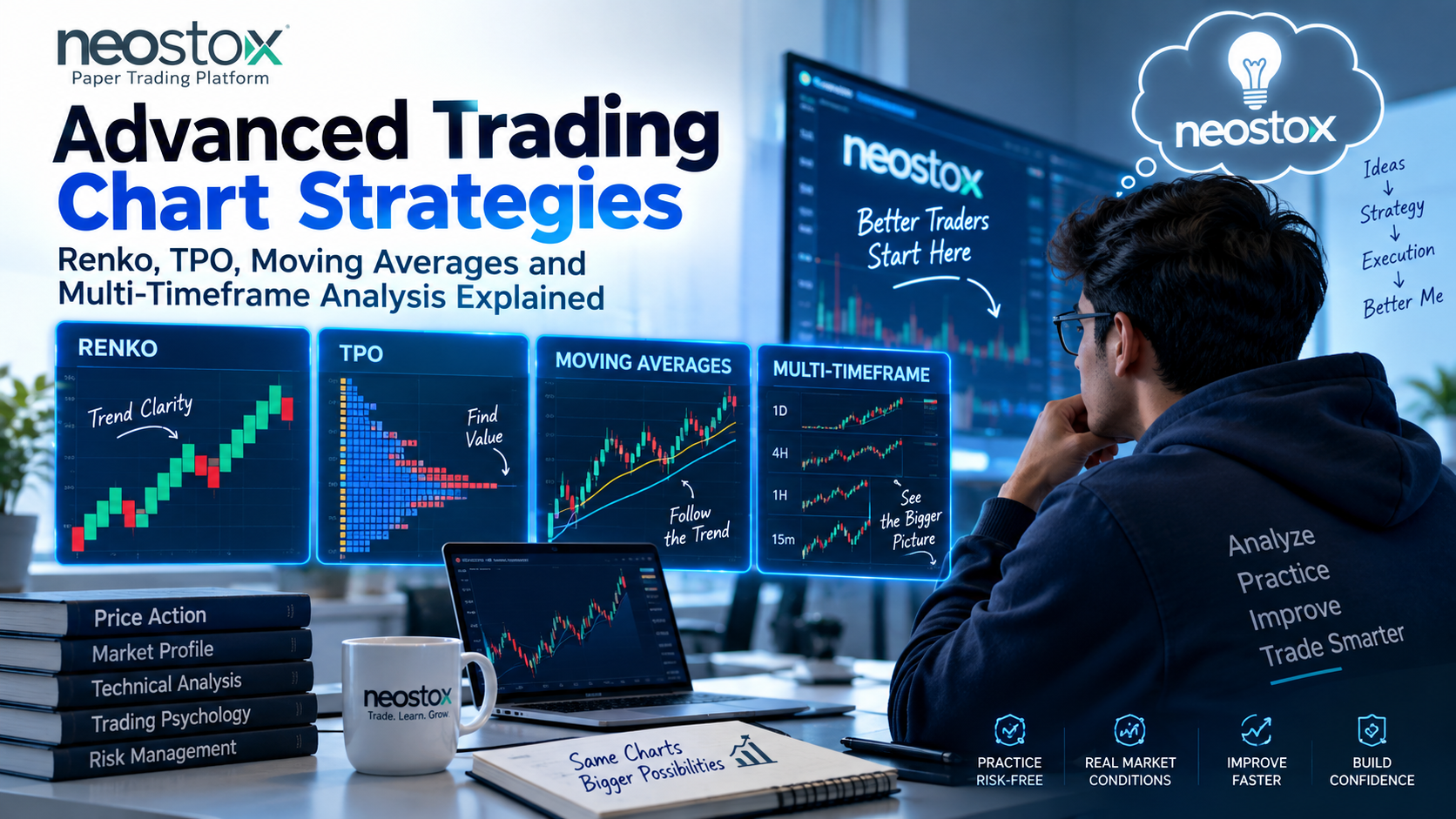
Comparison at a glance
| Technique | Purpose | Best timeframe | Strengths | Limitations |
|---|---|---|---|---|
| Renko charts | Filter out noise, isolate trend | Trending markets, any duration | Removes minor whipsaws, cleaner trend visibility | Loses time information, poor for precise entry timing |
| TPO / Market Profile | Show where value and time concentrated during a session | Intraday, session-based | Reveals fair value areas and acceptance/rejection zones | Complex to learn, works best on liquid, high-volume instruments |
| Moving averages | Confirm trend direction and dynamic support/resistance | Any, depends on the period chosen | Simple, widely understood, smooths noise | Lags price, generates false signals in choppy markets |
| Multi-timeframe analysis | Align entries with the broader trend | Combines two or more timeframes | Reduces trades against the larger trend | Can create conflicting signals if overused |
Use this table as a quick reference, then read the sections below for the actual judgment calls each technique demands.
Renko charts: when should you use them instead of candlesticks?
A Renko chart ignores time entirely and builds itself purely from price movement, adding a new "brick" only once price moves a fixed amount you've set in advance, say every ₹5 or every ₹10 depending on the stock. No brick forms if price hasn't moved enough, no matter how much time passes.
Use Renko when you specifically want to filter out the minor back-and-forth noise that makes trends hard to read on a regular candlestick chart, particularly useful in a genuinely trending market where you want a cleaner visual read on direction without every small pullback triggering a false signal. Don't reach for Renko when you need precise entry timing, since stripping out time also strips out information about how quickly a move happened, and don't use it in a choppy, range-bound market, where brick size becomes a constant guessing game and the chart can produce just as much noise as it was supposed to remove.
TPO - Market Profile: when do traders actually use it?
TPO, short for Time Price Opportunity, and often called Market Profile, was developed by J. Peter Steidlmayer at the Chicago Board of Trade in the early 1980s, and it shows something candlesticks don't: how much time price actually spent at each level during a session, not just where it opened, closed, or touched briefly. This builds a bell-curve-like shape, with a Point of Control, the price level where the most time was spent, and a Value Area around it.
Use TPO when you're trading intraday, particularly in liquid index futures or highly traded instruments, and want to understand where the market considers "fair value" versus where it's rejecting price quickly. Traders use the Value Area and Point of Control to spot whether price is accepted at current levels or likely to snap back toward where most trading actually concentrated. It's less useful, arguably not worth the learning curve, on illiquid or thinly traded stocks, where sparse data makes the profile unreliable, and it's genuinely more complex to learn than most beginner tools, worth picking up once you're comfortable with the fundamentals covered elsewhere, not as a first technique.
Moving averages: which ones, and when should you actually use each?
A simple moving average (SMA) weighs every price in its lookback period equally. An exponential moving average (EMA) weighs recent prices more heavily, making it react faster to new price action. Use an EMA when you want a more responsive read on recent momentum, use an SMA when you want a smoother, slower read less prone to overreacting to a single sharp move.
Shorter periods, like a 20-period average, work well for spotting near-term trend shifts and dynamic support during active trading. Longer periods, 50 or 200-period averages, are more commonly used for establishing the broader trend context, and the relationship between a 50 and 200-period average, sometimes discussed as a golden cross or death cross when they cross, gets watched as a longer-term trend signal, though it's worth treating any specific crossover as one input, not a guaranteed signal.
Moving averages genuinely struggle in choppy, sideways markets, where price crosses back and forth over the average repeatedly, generating a string of false signals in quick succession. They're a trend tool, and reaching for them in a market that isn't actually trending is where most of their reputation for "false signals" actually comes from.
Multi-timeframe analysis: how and when should you combine timeframes?
Multi-timeframe analysis means checking a higher timeframe, daily or weekly, to establish the broader trend and overall bias, then dropping to a lower timeframe, 15-minute or hourly, to time your actual entry within that context. The logic is straightforward: a short-term setup that lines up with the bigger trend tends to have better odds than one fighting against it.
Use this approach for swing trading and day trading alike, checking the higher timeframe first, before you even look at entry-level charts, so you're not accidentally taking a short-term long signal inside a broader daily downtrend. The risk shows up when you stack too many timeframes at once, three, four, five different charts all giving slightly different reads, since that tends to produce analysis paralysis rather than clarity. Two timeframes, one for context, one for timing, covers most situations without overcomplicating the decision.
How do traders combine these without overcomplicating a strategy?
Pick one primary technique to build your core read around, Renko for trend clarity, TPO for value-area context, or standard candlesticks with moving averages, rather than trying to run all of them simultaneously on every trade. Layering everything at once usually produces more conflicting signals than genuine insight, since each tool is optimized for a slightly different question.
Cap yourself at two timeframes for multi-timeframe analysis, one for broader context, one for entry timing, and a small, deliberate set of indicators, two or three at most, that you genuinely understand rather than a cluttered chart of overlapping signals. If two tools disagree, decide in advance which one wins in that situation, rather than making that call in the moment when you're also trying to place a trade. Simplicity, applied consistently, tends to outperform complexity applied inconsistently.
Neostox's charting tools support building these more advanced views on live NSE and BSE market conditions across equities, futures, and options, and paper trading gives you somewhere to actually test Renko-based trend reads, moving average setups, or a multi-timeframe approach with virtual money before applying any of it with real capital.